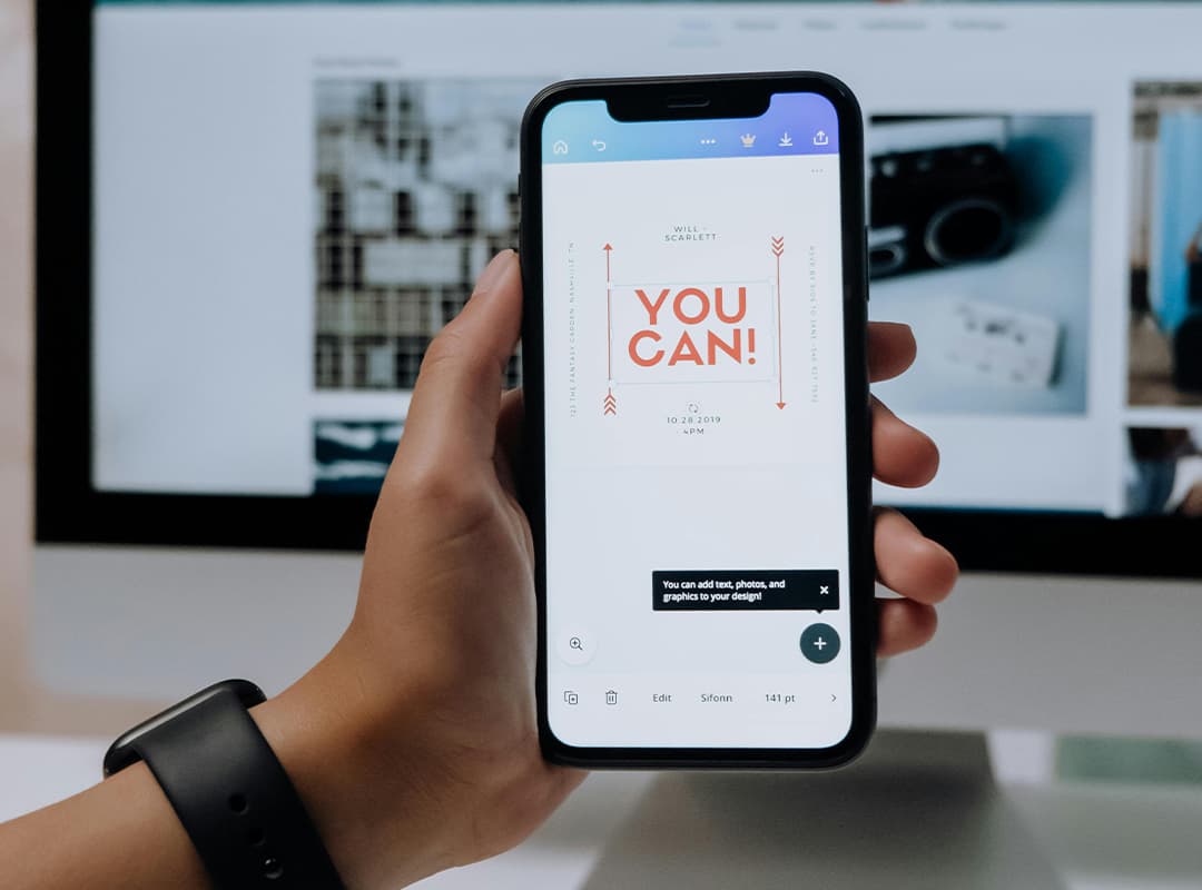
In today’s digital-first world, brands need to ensure their logos look great on everything from massive billboards to tiny smartphone screens. This demand for versatility has given rise to adaptive logos—designs that can change in size, complexity, or layout depending on the platform or device they appear on. By embracing adaptability, brands can maintain their visual identity while optimizing user experience across different touchpoints. Adaptive logos are a testament to the evolution of design and the importance of creating great logos that meet modern demands.
What Are Adaptive Logos?
Adaptive logos are flexible designs that adjust based on the medium they’re displayed on. Unlike static logos, which remain the same regardless of context, adaptive logos can transform in:
- Scale: Simplifying or adding details depending on size.
- Shape: Modifying layout or proportions for better fit.
- Color: Switching to monochrome or high-contrast versions for specific uses.
- Content: Including or omitting elements like taglines or icons based on the space available.
For example, a brand might use a detailed, full-color version of their logo on a website but opt for a simplified icon for a mobile app or social media profile.
Why Are Adaptive Logos Important?
- Cross-Device Consistency
In a world where users interact with brands on desktops, tablets, and smartphones, adaptive logos ensure the visual identity remains consistent and recognizable. A logo that’s too detailed for a small screen can become cluttered, while one that’s too simple might lose impact on larger displays. - Improved User Experience
An adaptive logo enhances readability and engagement. On small screens, stripped-down versions of logos are easier to process, ensuring clarity and legibility. - Versatility Across Mediums
From print to digital platforms, adaptive logos allow businesses to tailor their branding to fit specific requirements, like embroidery on merchandise or animation in videos. - Strengthening Brand Recognition
By adapting without losing core identity, adaptive logos reinforce brand recall. Users quickly associate different variations with the same brand, strengthening its presence across platforms.
Key Components of Adaptive Logos
1. Scalable Design
The foundation of an adaptive logo is scalability. This involves creating a logo that retains its essence in both large and small sizes. For instance, Google’s logo scales down to its simple “G” icon while maintaining recognizability.
2. Simplification for Small Screens
Details like intricate patterns or text-heavy designs should be removed or replaced with minimal elements for smaller displays. Adaptive logos often use a “responsive” approach, where the logo progressively reduces in complexity as the screen size shrinks.
3. Dynamic Elements
Some brands use motion or animation in their adaptive logos to transition between variations seamlessly. Animated logos can transform fluidly, offering an engaging experience while maintaining adaptability.
4. Monochrome and High-Contrast Versions
Adaptive logos often include a monochrome or high-contrast variant for use on darker or lighter backgrounds. This ensures visibility and legibility across different mediums, such as print, merchandise, and digital interfaces.
5. Modular Components
Breaking down a logo into modular elements—like an icon, text, and tagline—allows designers to recombine or omit parts based on space and context. For example, a full logo might include a symbol, brand name, and slogan, while the compact version only uses the symbol.
Examples of Great Adaptive Logos
Nike: The iconic swoosh works in every context, from apparel to mobile apps, thanks to its simplicity and adaptability.
Coca-Cola: The brand uses its full wordmark for large-scale advertising while employing the dynamic wave element for smaller platforms.
Spotify: Spotify’s adaptive logo ranges from the full name with the wave icon to just the wave icon on app buttons, maintaining a cohesive identity.
How to Create an Adaptive Logo
- Start with a Strong Core Design
A great adaptive logo begins with a strong foundational design that embodies your brand’s identity. Focus on simplicity, as overly complex designs are harder to adapt. - Consider All Possible Platforms
Think about where your logo will appear: websites, social media, apps, packaging, and print. Plan variations that suit each format. - Test for Scalability
Ensure your logo remains recognizable and legible at different sizes. Shrink your design to see if it still conveys your brand effectively. - Use a Vector-Based Format
Creating your logo in vector format (e.g., SVG) ensures scalability without losing quality. This is essential for creating multiple adaptive versions. - Leverage Professional Tools
Logo design software often includes templates and tools to help create scalable, adaptive logos. If you’re looking for assistance, consider hiring a designer or using an advanced logo maker platform to refine your design.
Adaptive logos are the future of branding in a multi-device world. They allow businesses to maintain consistency while catering to the unique demands of various platforms and devices. By focusing on scalability, simplicity, and modularity, brands can create great logos that are both versatile and impactful. Whether you’re rebranding or starting fresh, investing in an adaptive logo ensures your brand is ready for any medium.
